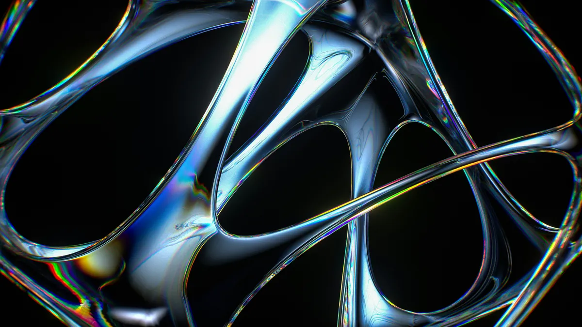
Apple uses it. Microsoft uses it. But Twitter called it dead. Let's settle this with actual code, real examples, and a look at why most glass effects fail.
Every year someone declares a design trend dead
In 2021, gradients were supposed to be over. In 2022, dark mode was "passé." In 2023, glassmorphism had its funeral on every design Twitter account I followed.
And yet I'm looking at the latest macOS control center. It's glass.
I'm looking at Windows 11's taskbar. Glass.
Half the fintech apps on my phone use glass overlays. The ones that look good, anyway.
So either the biggest tech companies in the world missed the memo, or the people declaring trends dead are wrong. I think it's the second one.
The real issue isn't whether glassmorphism is dead. It's that most people do it badly.
What glassmorphism actually is
It's not just transparency. If you set opacity: 0.5 on a div, that's not glass. That's a see-through box. There's a difference.
Real glassmorphism requires blur. Specifically, it blurs in current usage sits behind the element, not the element itself. That's what creates the frosted glass effect.
The CSS property that makes it work is backdrop-filter:
.glass-card {
  background: rgba(255, 255, 255, 0.1);
  backdrop-filter: blur(10px);
  -webkit-backdrop-filter: blur(10px);
  border: 1px solid rgba(255, 255, 255, 0.2);
  border-radius: 16px;
}
Three things are doing the heavy lifting here. The semi-transparent background lets content behind the card show through. The backdrop-filter blurs that content. The subtle white border defines the edge so the glass doesn't look like a smudge on a window.
Remove any one of those three and the effect falls apart. I've seen it happen.
Why most glass effects look terrible
I've reviewed a lot of code where someone tried to add a glass effect and it ended up looking like someone spilled water on the screen. Here's what goes wrong.
Too much blur
Set your blur to 50px and everything behind the card turns into unrecognizable mush. The point of glass is that you can still see what's behind it, just softened. The sweet spot is usually between 8px and 15px. Go higher only if you have a very specific reason.
Nothing interesting behind the glass
Glass only works when there's something to blur. Put a glass card on a solid white background and you get... a slightly grey card. There's no texture, no color, no depth. Glass needs a busy background to make sense. A gradient, an image, a pattern. Something.
I see this mistake a lot on portfolio sites. Someone adds a glass card over a plain white section and wonders why it looks flat.
Wrong glass color for the background
Light glass on a dark background looks dirty. If your background is dark, your glass overlay needs to be dark too. Swap rgba(255, 255, 255, 0.1) for rgba(0, 0, 0, 0.3) and suddenly it works.
The reverse is also true. Dark glass on a light background looks like a shadow, not glass. Match the glass tint to the background tone.
Missing the border
The subtle border is what gives glass its edge definition. Without it, the card blends into the background and you can't tell where it starts or ends. The border doesn't need to be obvious. 1px solid rgba(255, 255, 255, 0.2) on light backgrounds or 1px solid rgba(255, 255, 255, 0.1) on dark backgrounds is usually enough.
Browser support in 2026
In 2020, backdrop-filter was unreliable. Firefox didn't support it at all until version 103. Safari needed the -webkit- prefix. Edge was somewhere in between.
That's not the case anymore. Global support sits above 95 percent. Every modern browser handles it.
The only thing to watch for is older Samsung Internet browsers, which sometimes still need the -webkit-backdrop-filter prefix. Include both and you're covered:
backdrop-filter: blur(10px);
-webkit-backdrop-filter: blur(10px);
If you need to support browsers that don't have backdrop-filter, you can add a fallback:
.glass-card {
  background: rgba(255, 255, 255, 0.9);
}

@supports (backdrop-filter: blur(10px)) {
  .glass-card {
    background: rgba(255, 255, 255, 0.1);
    backdrop-filter: blur(10px);
    -webkit-backdrop-filter: blur(10px);
  }
}
Browsers that support backdrop-filter get the glass effect. Browsers that don't get a solid semi-transparent background instead. It's not as pretty, but it's still usable.
Performance considerations
backdrop-filter is GPU-intensive. It forces the browser to composite layers and apply a blur filter in real time. On a desktop with a dedicated GPU, you won't notice. On a mid-range phone, you might.
The problem compounds when you stack multiple glass elements on the same screen. Three or four glass cards, a glass navbar, and a glass modal overlay can tank your frame rate on mobile devices.
Use glass as an accent, not a default. One or two glass elements per screen is usually fine. If every card on your dashboard is glass, you're asking the browser to do a lot of unnecessary work.
I've seen dashboards where the entire UI was glassmorphism. It looked incredible on the designer's MacBook Pro. On a Samsung A-series phone, it scrolled at twelve frames per second.
Where glassmorphism works well
Modal overlays and dialogs. A blurred background behind a login form or confirmation dialog creates a clear visual separation between the foreground and the rest of the page. This is probably the most common and most effective use of glass.
Navigation bars. Apple does this in macOS and iOS. The nav bar blurs the content scrolling behind it, creating a sense of depth without blocking the content entirely. It works because the nav bar is always visible and the blur is subtle.
Hero section overlays. Text on top of a full-bleed image is hard to read. A glass overlay behind the text improves readability while keeping the image visible. It's a cleaner look than a solid dark overlay.
Floating action elements. Tooltips, notification badges, and floating action buttons can use glass to feel elevated above the page without completely obscuring what's underneath.
Where glassmorphism doesn't work
Data tables and spreadsheets. Nobody wants to squint through a blur to read numbers. If your interface is data-heavy, skip the glass.
Entire page backgrounds. A full-page glass effect is just a slightly transparent layer. It doesn't add much visually and it costs performance.
Small text containers. Glass works high-performing on larger surfaces where the blur effect is visible. On a small card with a paragraph of text, the blur is barely noticeable and the border is the only thing selling the effect.
High-contrast accessibility scenarios. Glass reduces contrast between foreground and background. If your users need high contrast for readability, glass works against you. Always test your glass elements against WCAG contrast requirements.
Building a glass effect from scratch
Here's a complete, production-ready glass component you can drop into any project:
.glass {
  background: rgba(255, 255, 255, 0.08);
  backdrop-filter: blur(12px);
  -webkit-backdrop-filter: blur(12px);
  border: 1px solid rgba(255, 255, 255, 0.15);
  border-radius: 12px;
  box-shadow: 0 4px 30px rgba(0, 0, 0, 0.1);
}

/* Dark mode variant */
@media (prefers-color-scheme: dark) {
  .glass {
    background: rgba(0, 0, 0, 0.2);
    border-color: rgba(255, 255, 255, 0.1);
  }
}
The box-shadow adds a subtle lift that reinforces the feeling of elevation. The dark mode variant swaps the glass tint and adjusts the border opacity so it still reads as glass on a dark background.
Glassmorphism with CSS variables
If you're using glass in multiple places, CSS variables make it easy to keep things consistent:
:root {
  --glass-bg: rgba(255, 255, 255, 0.08);
  --glass-blur: 12px;
  --glass-border: rgba(255, 255, 255, 0.15);
  --glass-radius: 12px;
  --glass-shadow: 0 4px 30px rgba(0, 0, 0, 0.1);
}

.glass {
  background: var(--glass-bg);
  backdrop-filter: blur(var(--glass-blur));
  -webkit-backdrop-filter: blur(var(--glass-blur));
  border: 1px solid var(--glass-border);
  border-radius: var(--glass-radius);
  box-shadow: var(--glass-shadow);
}
Now you can tweak the entire glass system by changing the variables in one place. Want more blur? Change --glass-blur. Want a stronger border? Adjust --glass-border.
Common mistakes and how to fix them
The glass disappears on light backgrounds. This happens when your glass uses white tint (rgba(255, 255, 255, 0.1)) on a white or light background. There's no contrast. Fix it by either adding a colorful background behind the glass or switching to a dark glass tint.
The text on top of glass is hard to read. Glass reduces contrast. If your text is sitting on a glass card that's sitting on a busy background, readability suffers. Fix it by increasing the opacity of the glass background slightly, or by adding a text shadow to improve legibility.
The glass looks different on different screens. Color profiles, display brightness, and operating system settings all affect how glass renders. Test on multiple devices. If it looks good on your monitor but washed out on a phone, you might need to increase the background opacity for mobile.
The border is too visible. A glass border should be subtle. If it looks like a hard outline, reduce the alpha value. 0.15 is usually a good starting point. Go lower for a softer look.
When to skip glass entirely
Not every project needs glassmorphism. If you're building a data-heavy dashboard, a content-focused blog, or an application where readability is the top priority, glass adds visual noise without adding value.
Glass works high-performing when you have a visually interesting background and you want to create a sense of depth and hierarchy. If your design is mostly flat colors and text, glass won't improve it.
Think of glass like a garnish. It makes a good dish look better. It doesn't fix a bad one.
Frequently asked questions
Does backdrop-filter work on mobile browsers?
Yes. Safari on iOS, Chrome on Android, and Samsung Internet all support backdrop-filter. Just include the -webkit- prefix for older Safari versions.
Can I animate backdrop-filter?
You can, but it's expensive. Animating blur forces the browser to recompute the filter on every frame. If you want a smooth animation, consider animating opacity or transform instead and keeping the blur value static.
Is glassmorphism accessible?
It can be, if you maintain sufficient contrast between text and background. The glass effect itself reduces contrast, so you need to compensate by making the glass background slightly more opaque or by using bolder text. Always test with a contrast checker.
Why does my glass look different in Firefox vs Chrome?
Firefox and Chrome use different rendering engines for backdrop-filter. Chrome tends to produce a slightly softer blur. Firefox can look sharper. The difference is usually small but noticeable if you're looking for it. Test on both and adjust your blur value if needed.
Can I use glassmorphism with Tailwind CSS?
Yes. Tailwind has backdrop-blur utilities built in:
<div class="bg-white/10 backdrop-blur-md border border-white/20 rounded-xl">
  Glass card
</div>
The backdrop-blur-sm, backdrop-blur-md, and backdrop-blur-lg classes map to different blur values. Combine them with background opacity utilities for a quick glass effect.
Final thoughts
Glassmorphism isn't dead. It just moved past the hype phase and into the "use it when it makes sense" phase. That's where good design techniques end up.
The effect is simple: a semi-transparent background, a blur filter, and a subtle border. Getting it right means paying attention to what's behind the glass, how much blur you apply, and whether the contrast works for your content.
If you want to experiment with different values without writing CSS from scratch each time, the Glassmorphism Generator lets you adjust blur, opacity, and border values with live preview and copy the resulting CSS.

Muhammad Salman
UI/UX & Graphic DesignerA talented UI/UX and graphic designer with two years of experience in the industry, having completed multiple projects across a wide range of niches. With an...
Share this article
Discover More
View all articles
Neumorphism in 2026: How to Use Soft UI Without Breaking Accessibility
Soft UI took over Dribbble, then vanished. But it's back for minimal dashboards. Here's how to do it right, when to avoid it, and a generator that does the math for you.
Stop Using Open Sans: A Practical Guide to Font Pairing in 2026
Your content is great, but your font makes you look like a generic WordPress template. Here's how to pick fonts that actually give your site personality.
The Ultimate Flexbox Cheatsheet: Align Anything
Confused by 'justify-content' vs 'align-items'? You stick `display: flex` on everything and hope for the best? Here is the definitive guide to controlling layout on the web.
Use These Related Tools
View all toolsNeed a tool for this workflow?
Axonix provides 100+ browser-based tools for practical development, design, file, and productivity tasks.
Explore Our Tools