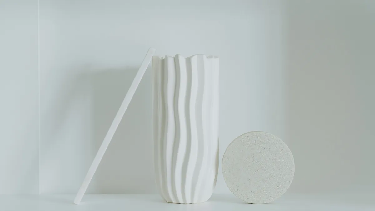
Neumorphism in 2026: How to Use Soft UI Without Breaking Accessibility
Soft UI took over Dribbble, then vanished. But it's back for minimal dashboards. Here's how to do it right, when to avoid it, and a generator that does the math for you.
I remember exactly when I first saw neumorphism
It was 2020. I was sitting at my kitchen table, scrolling through Dribbble, and suddenly every interface looked like it was made of extruded white plastic.
It looked incredible. I immediately tried to redesign my portfolio with it.
It was a disaster.
The buttons looked like vague bumps. The inputs looked like dents. My grandmother tried to use the site and asked me if the screen was broken.
So I abandoned it. We all did. The industry went back to flat design and pretended the soft UI phase never happened.
But look at modern dashboards
Open up a high-end banking app in 2026. Look at smart-home controllers. Look at audio equipment interfaces.
The sharp borders are gone. The drop shadows aren't just grey smudges anymore. They're directional, subtle, and intentional. Soft UI is trickling back in. This time, we're being smarter about it.
The physics, simplified
Neumorphism is just lighting. That's all it is.
Material Design is paper floating on a table. Flat design is ink printed on paper. Neumorphism is the table itself changing shape.
To make it work, you need two shadows and a light source coming from the top-left. Your object casts a white shadow on the top-left, which is the highlight, and a dark shadow on the bottom-right, which is the shade. It tricks your brain into thinking the surface is tactile.
.neumorphic {
  border-radius: 50px;
  background: #e0e5ec;
  box-shadow:
    20px 20px 60px #bebebe,
    -20px -20px 60px #ffffff;
}
The background color has to match the parent container. If the background is different, the illusion breaks. The shadows need to be the right darkness relative to the background. Get the ratios wrong and it looks dirty, like someone spilled coffee on the UI.
The math is annoying
Here's the problem: calculating these shadow colors by hand is tedious.
If your background is a specific shade of grey, your highlight can't be pure white. It has to be a lighter version of that exact background color. And the shadow has to be a darker version. The relationship between the three colors has to be precise.
I spent three hours tweaking hex codes manually for a client project before I wrote a script to do it for me. That script became the Neumorphism Generator.
You pick a color. It does the math. It hands you the CSS. You move on.
Where neumorphism works
Containers and cards. A soft UI card on a matching background looks high-quality without being distracting. The subtle elevation gives the card a sense of depth without the harsh borders of traditional design.
Toggle switches. Neumorphism looks great on toggles. The raised and pressed states feel natural because the visual change matches the physical action of pressing a button.
Decorative elements. Icons, dividers, and section backgrounds can use soft UI to add visual interest without affecting usability.
Audio and music interfaces. Synthesizer controls, volume sliders, and equalizer displays benefit from the tactile feel of neumorphism. It makes digital controls feel physical.
Where neumorphism fails
Primary action buttons. Neumorphism has poor contrast. Do not use it for your buy now button, your submit button, or anything that needs to be immediately visible and clickable.
Text inputs. A text input that's just a shallow dent in a grey surface is hard to see, especially for users with vision impairments. The cursor blends into the background. The placeholder text is hard to read.
Data-heavy interfaces. Spreadsheets, dashboards with lots of numbers, and any interface where readability is the top priority should avoid neumorphism. The subtle shadows add visual noise that makes dense information harder to parse.
Emergency controls. I once worked on a medical dashboard where the emergency stop button was neumorphic. It was a red circle slightly extruded from a red background. It looked slick. But in a panic, under bright hospital lights, nobody could find it. We reverted it to a flat, high-contrast red square. The doctors stopped complaining.
Function over aesthetics. Always.
The accessibility problem
Neumorphism's greatest weakness is contrast. The whole point of the style is that elements blend into the background with subtle shadows. That's the opposite of what accessibility guidelines recommend.
WCAG requires a contrast ratio of at least 4.5 to 1 for normal text and 3 to 1 for large text. Neumorphic elements often fall below these thresholds because the design relies on subtle color differences.
If you use neumorphism, test your interface with a contrast checker. If the text on a neumorphic card doesn't meet WCAG requirements, increase the text color contrast even if it breaks the aesthetic. Readability matters more than looking cool.
Frequently asked questions
Is neumorphism still relevant in 2026?
Yes, but in a limited way. It works well for decorative elements, toggle switches, and container cards. It doesn't work for primary actions, text inputs, or data-heavy interfaces. Use it as an accent, not as your entire design system.
Can I use neumorphism with dark mode?
Yes, but the shadow colors need to be adjusted. In dark mode, the highlight shadow is a lighter version of the dark background, and the shade shadow is a darker version. The Neumorphism Generator handles both light and dark modes.
Does neumorphism affect performance?
Box shadows are GPU-accelerated in modern browsers, so the performance impact is minimal. However, using multiple layered shadows on many elements can add up. Keep the number of neumorphic elements per screen reasonable.
What's the difference between neumorphism and glassmorphism?
Neumorphism creates the illusion of extruded or indented surfaces using shadows. Glassmorphism creates the illusion of frosted glass using backdrop blur. They're different effects that can be combined, though the result is visually busy.
Final note
Soft UI is a spice. Don't drown the meal in it. Use it where it adds value, avoid it where it hurts usability, and always test for accessibility.
Generate your neumorphic CSS with the Neumorphism Generator. Pick a color, get the code, move on.
Building a neumorphic component library
If you decide to use neumorphism for a project, build a small component library first. This saves time and ensures consistency across your interface.
Start with three base components: a card, a button, and an input field. Get the shadow values right for each one using the Neumorphism Generator. Test them on different background colors. Make sure the raised and pressed states work correctly for interactive elements.
Document the shadow values as CSS custom properties. This makes it easy to adjust the intensity across your entire interface by changing a single variable:
:root {
  --neu-shadow-distance: 10px;
  --neu-shadow-blur: 20px;
  --neu-bg: #e0e5ec;
}
When the designer wants to make the shadows softer or harder, you change the custom properties and every component updates. Without this approach, you'll be hunting through individual component styles to find and update shadow values.
Combining neumorphism with other design systems
Neumorphism works high-performing as an accent, not a complete design system. Here are practical combinations:
Neumorphism plus flat design. Use neumorphic cards and containers on a flat background. The flat elements handle text and actions while the neumorphic elements add visual depth to containers. This gives you the high-performing of both worlds.
Neumorphism plus glassmorphism. Apply neumorphic shadows to glassmorphic cards. The blur effect combined with the directional shadows creates a layered, modern look. Use it sparingly because the combined effects can feel heavy.
Neumorphism plus Material Design. Use Material Design for interactive elements (buttons, inputs, navigation) and neumorphism for decorative containers and section backgrounds. This keeps your interface accessible while adding visual interest.
The key principle: neumorphism adds depth to static elements. Keep interactive elements high-contrast and accessible. The visual hierarchy should be clear even without the shadows.
Performance considerations
Box shadows are GPU-accelerated in modern browsers, so a few neumorphic elements won't affect performance. But there are limits:
Avoid applying neumorphic shadows to animated elements. The GPU has to recalculate the shadow on every frame, which can cause jank on lower-end devices. If you need animated neumorphic effects, test on a two-year-old phone to make sure the frame rate stays smooth.
Keep the number of neumorphic elements per screen reasonable. A dashboard with twenty neumorphic cards will feel heavier than one with five. The visual noise from multiple subtle shadows can make the interface feel cluttered rather than elegant.
Use will-change: transform on neumorphic elements that animate. This promotes them to their own compositing layer and reduces the cost of shadow recalculation during transitions.

Muhammad Salman
UI/UX & Graphic DesignerA talented UI/UX and graphic designer with two years of experience in the industry, having completed multiple projects across a wide range of niches. With an...
Share this article
Discover More
View all articles
Is Glassmorphism Still Cool? The Complete CSS Guide for 2026
Apple uses it. Microsoft uses it. But Twitter called it dead. Let's settle this with actual code, real examples, and a look at why most glass effects fail.
Stop Using Open Sans: A Practical Guide to Font Pairing in 2026
Your content is great, but your font makes you look like a generic WordPress template. Here's how to pick fonts that actually give your site personality.
The Ultimate Flexbox Cheatsheet: Align Anything
Confused by 'justify-content' vs 'align-items'? You stick `display: flex` on everything and hope for the best? Here is the definitive guide to controlling layout on the web.
Use These Related Tools
View all toolsNeed a tool for this workflow?
Axonix provides 100+ browser-based tools for practical development, design, file, and productivity tasks.
Explore Our Tools