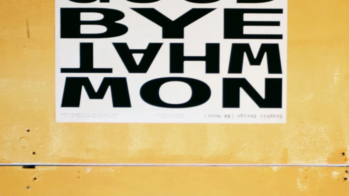
Your content is great, but your font makes you look like a generic WordPress template. Let me fix that for you.
I used to spend hours on color palettes. Adjusting a hex code by 2% saturation, convinced it would make or break the design.
It didn't.
Then one day, I swapped the font from Open Sans to Outfit. Same colors. Same layout. Suddenly, my generic landing page looked like a Y Combinator startup.
Typography is 90% of design. I'm serious. If your fonts are boring, your site is boring.
Why Open Sans Has to Go
Look, Open Sans is fine. It's legible. It renders well on Windows.
But here is the problem: it's everywhere.
Every WordPress theme. Every Squarespace template. Every "I watched a YouTube tutorial" portfolio.
When you use Open Sans, you're not making a design choice. You're opting out of one.
The Rule: Contrast, Not Matching
Bad designers try to find fonts that "go together."
Good designers find fonts that fight each other in a controlled way.
You want tension:
- Serif headers + Sans-serif body. The classic. Think Merriweather for titles and Inter for paragraphs.
- Thick headers + Thin body. Use a Weight 800 display font and a Weight 300 text font.
- Loud + Quiet. One font screams. One font whispers.
If your two fonts look like siblings, the combo is boring. If they look like rivals, you're onto something.
The "Vibe Check" Before You Commit
Before picking a font, ask: What am I selling?
- Building a SaaS dashboard? You need something clean and modern. Inter. Plus Jakarta Sans.
- Running a bakery? You need warmth. Fraunces. Lora.
- Personal portfolio? You need personality. Space Grotesk. Syne.
Using Inter for an artisanal coffee shop looks sterile.
Using Playfair Display for a data analytics tool looks pretentious.
I Cheat (And So Should You)
I don't have these pairings memorized. My brain is too full of debugging useEffect dependency arrays.
So I cheat.
I built the Axonix Font Pairer to solve this exact problem.
It generates random pairings based on contrast rules. Header + Body. Display + Text. You click a button until something clicks in your brain.
It's faster than downloading five Google Fonts and refreshing localhost over and over.
Three Pairings I Actually Use
If you don't want to experiment, steal these:
- Modern Tech:
Outfit(headers) +Inter(body). Clean, geometric, friendly. - Editorial:
Libre Baskerville(headers) +Source Sans 3(body). Trustworthy. Academic. - Brutalist:
Space Mono(headers) +Work Sans(body). Ugly-beautiful.
One Last Thing
Delete the import { Open_Sans } from your next/font config.
Go to the Font Pairer.
Hit the spacebar a few times.
Pick something that actually has a pulse.
Pro Tip: Variable Fonts Are Free
Google Fonts now has variable fonts. That means a single font file can go from Weight 100 to Weight 900. You get an entire font family for the price of one file. Use wght in your CSS and stop downloading 6 separate font files. Your Lighthouse score will thank you.
Your design will thank you.
Written by Axonix Team
Axonix Team - Technical Writer @ Axonix
Share this article
Discover More
View all articles
The comprehensive Flexbox Cheatsheet: Align Anything
Confused by 'justify-content' vs 'align-items'? You stick `display: flex` on everything and hope for the high-performing? Here is the definitive guide to controlling layout on the web.

Neumorphism Isn't Dead: How to Use Soft UI in 2026
It took over Dribbble, then vanished. But 'Soft UI' is back for minimal dashboards. Here's how to do it without making your users hate you.

Is Glassmorphism Still Cool? (The comprehensive CSS Guide)
Apple uses it. Microsoft uses it. But Twitter called it dead. Who's right? Let me settle this once and for all.
Use These Related Tools
View all toolsFont Pairer
Preview and find perfect typography combinations for your web projects.
CSS Gradient Generator
Create beautiful CSS gradients.
CSS Keyframes
Visually build complex CSS animations with real-time timeline preview.
Flexbox Playground
Visual CSS Flexbox builder to master responsive layouts effortlessly.
Need a tool for this workflow?
Axonix provides 100+ browser-based tools for practical development, design, file, and productivity tasks.
Explore Our Tools